Favourite Piece from ‘Goya: The Portraits’

Sometimes exhibitions don’t particularly take your breath away but there are still pieces which stand out. I have realised that, while I was not overwhelmed by the recent exhibition of Goya’s portrait paintings at the National Gallery, there was one painting which I have continued to think about. Therefore, I thought I would share it here although the exhibition ended last month.

1400-goya-self-portrait-before-an-easel-c1792

This is one of the few self-portraits which was included in the exhibition and depicts Goya wearing his candle-holder hat, of his own design. This allowed him to paint in a greater variety of lights and not be so dependent on natural light for his sittings. I was intrigued by the mechanics (and dangers!) of such a hat and wished that they had a copy of it for reference. Would the candle wax have dripped on to his clothes or face? Was there ever the possibility that the painting could be damage by smoke or fire if Goya leant too close to his work? He looks out of the painting with great confidence and is clearly dressing to impress the viewer, with a flamboyant jacket with red and gold trimming and therefore holds his hat to the same expectations. Some of the other portraits were overwhelmed by the finery of their dress or had very guarded expressions so their eyes stared blankly from the canvases. This portrait gave one of the best senses of the character and personality of its subject, with the background of the studio portrayed in very minimal detail.

From now on when I see a Goya portrait I will always have this image of him in my head, the inventive and showman artist, which is probably exactly what he intended as he painted this portrait.

Taylor Wessing Photographic Portrait Prize 2015

800_2015_0620

Portraiture is a sly medium, always suggesting it depicts a simple truth, particularly in photography, but it is as much about what it conceals or obscures as it is about the character it claims to reveal. The Taylor Wessing prize each year at the National Portrait Gallery emphasises this as it highlights how much a winning portrait is down to craft rather than subject or story. On each wall of this small exhibition hang the faces of actors, butchers, children, officials, friends or family without an order of precedence, Instead, it is the startling background colours, the framing of the subject’s face and the photograph’s composition which always catches my eye.

I have found that although I am interested to see who is judged a winner or highly commended I do not always agree. My particular favourite of the exhibition was Yngvild by Tereza Červeňová (shown above) which appears to make the dreams of the Pre-Raphaelites a reality and actually won the John Kobal New Work prize. I was amazed by how much a photograph could echo such a fantastical genre of painting and yet also be a likeness of someone the Červeňová has met at a wedding. It would be interesting to compare this photograph with others of the same person to tell whether the overwhelming Pre-Raphaelite feel is related to the angle and light or whether it could only have been created with that particular sitter.

The exhibition continues until the 21st of February and creates a delightful pause in a London afternoon. You’ll then be able to see the other winners and let me know what you think!

Drawing in silver to gold: Leonardo to Jasper Johns

Right up at the top of the British Museum there is currently a delightful exhibition on the Renaissance technique of metalpoint drawing. It draws on a huge selection from the British Museum (and Her Majesty’s) archives to demonstrate how the medium has evolved and adapted since it was first used by devotees Leonardo da Vinci and Hans Holbein the Elder. Some of the older pieces involved are clearly preparatory sketches for larger works and reference tools to show either prospective clients or to use within the studio. Metalpoint allowed for great detail, such as in Leonardo’s famous helmeted soldier, whilst also being portable and easily stored. However, as the technique becomes less well known and rarely taught it is treated as an individual method which is an end in itself, often resulting in intimate or personalised works. I was particularly interested to read about one recent commissioned silverpoint work which had been created by melting down a client’s gold watch to form the stylus to draw with.

The technique involves using a metal stylus, usually of silver or gold, which transfers onto a specially prepared abrasive paper to create the delicate lines. The paper itself requires great skill to prepare as it involves a mixture of animal bones, or other gritty substances, combined with an adhesive and a coloured wash before painting the paper itself. This initial preparation must be consistent as it is difficult to erase marks after the metal stylus is applied to the paper. Although the main colour used for the paper was a light reddish colour there was also a variety of blues and greys depending on the metal used in the stylus.

The exhibition provides an interesting overview of how metalpoint has been used and valued over the years and one of my favourite pieces demonstrating this was that of a metalpoint book. This was a small journal-type volume which was created using the specially prepared paper and had a metal stylus in its fastening. Its portability allowed its owner to sketch using metal point outside and draw landscapes or spontaneous scenes, and therefore these journals were often used by artists during the 17th and 18th centuries. This simple adaptation of the technique’s tools illustrated its move out of the studios and into the everyday, intimate life of an artist.

The exhibition continues until the 6th of December so there is still just over a month to visit this intriguing selection of pieces and enjoy the fruits of the British Museum’s archives as well as learning about this unusual artistic technique.

Summer 2015

It’s been a busy summer for me and unfortunately this blog has had an enforced hiatus following the sudden demise of my laptop, lots of fun travel and moving house rendering me temporarily without internet connection. However, these disruptions have not stopped me from visiting interesting exhibitions, seeing great films and theatre and reading a mountain of books! I therefore thought I’d do a quick round up of highlights from the last few months so that I still got to talk about them.

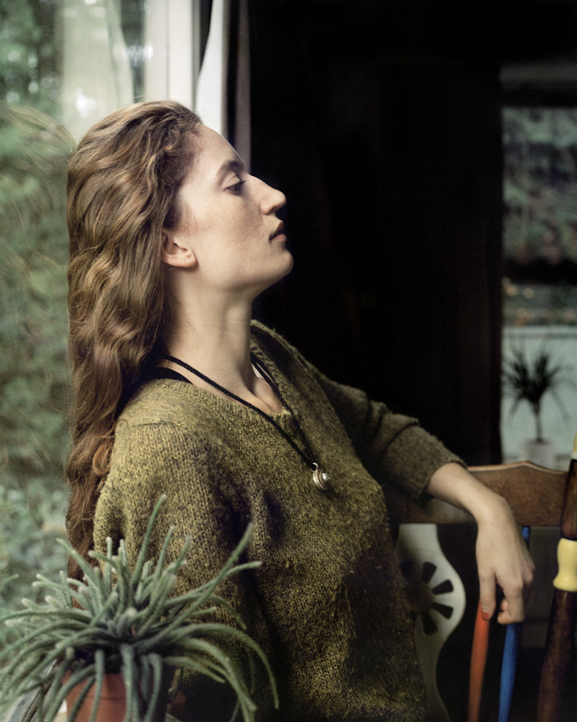
This exhibition at the National Portrait Gallery is one that I love to return to year after year as I am continually surprised by the variety of how representation of the human form cnullan be approached. I may not always agree with the judges’ decision, this year some of my favourites were not even placed or commended, but this exhibition really does force the viewer to keep reassessing portraiture’s position in modern society. Descriptions accompanying the paintings highlight how different artists view the medium, with some attempting to provide a new interpretation on an age old tradition while others aim to show previously neglected subjects who might not have been treated to the same level of detail by previous painters. We no longer need it to record a likeness since photography is instant and accurate and often painted portraits do not even try to depict reality, featuring impossible shadows or proportions. This exhibition is sadly over but you can view all the portraits here so don’t worry about missing out!

null
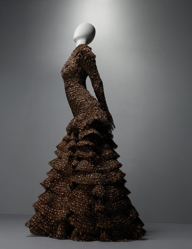
Shoes are an essential part of any outfit, no matter how fashion conscious one might be, to protect the feet and ensure that any journey by foot is without hazards. However, the V&A’s current exhibition (open until the 31st of January 2016) illustrates how little this practicality can matter when aesthetics and style are brought into consideration. It demonstrated that shoes have never been solely practical items, with absurd pointed shoes from medieval courts, tiny slippers for the bound feet of Chinese women and delicately embroidered Regency mules. The shoes only became yet more intricate as the centuries progress and I particularly enjoyed the video sequence towards the end which interviewed modern cobbler greats, such as Manolo Blahnik and Sandra Choi. They suggested some of the reasons that might lead someone to choose a glittering set of heels over the latest trainers despite the practicalities of life. It made me reassess my current footwear choices and perhaps my next shoebox will contain something suitably daring…

This is a film that I have been looking forward to for a long time, especially since I watched Frances Ha in April. I am pleased to report that I was not disappointed in the slightest although it turned out to be a very different film to what I originally expected to see. The trailer suggests that the film, directed by Noah Baumbach, will focus on how Tracy (Lola Kirke) and Brooke’s (Greta Gerwig) relationship as new found sisters develops with New York as a background. Instead the plot quickly sweeps Tracy and the viewer up into the whirlwind of Brooke’s life as she bubbles over with ideas of how she will make her name, fortune or both. As a shy freshman in college, Tracy admires Brooke’s enthusiasm and willingness to try anything and tries to emulate her by creating a more assertive and carefree demeanour. However, this all ends in a denouement which is both comic and dramatic and is worth the price of the film (whether cinema ticket or DVD) alone.

Two involuntarily impoverished gentlemen have settled on a scheme to trick a rich provincial heiress to marry one of them by posing as a rich man travelling with his manservant before splitting the resulting dowry. However, this quickly descended into chaos as it is revealed they are not the only characters with hidden motives and they also soon learn that sometimes the head might be ruled by the heart, even when faced with mountains of gold. I thought Samuel Barnett as Mr Aimwell and Geoffrey Streatfeild as Mr Archer created a believable and dynamic partnership as they tried to stay ahead of those around them. I also felt that the play really came alive with the addition of the songs, which I hadn’t initially expected. A particular favourite was the ‘It’s a Trifle’ song which I’m sure nearly every audience member left the theatre humming. Although the run of this particular play has now finished it is scheduled to be shown in cinemas shortly as part of the National Theatre’s national programme so if you can get tickets I would definitely recommend it!


This autumn I already have plans for reading lists, exhibitions, theatre visits and many more so expect to hear from me again soon!

DLA Piper Series: Constellations

I recently had the chance to go to one of the Tate’s regional outposts in Liverpool. I had not been to Liverpool before but I had high expectations since it was crowned the European Capital of Culture in 2007. The museum is neatly tucked into the carefully renovated Albert Docks and so is surrounded by views of the Merseyside and the boats that fill it. Albert Docks is an area I would definitely recommend visiting if you are in Liverpool even if you are not planning on visiting the Tate Liverpool. However, if you do have time the museum is one of Liverpool’s highlights which should not be missed.

Unfortunately I did not have an unlimited amount of time to spend in the Tate Liverpool and so had to be selective about the exhibitions that I choose. My first choice was a little unlucky as it was a black and white photogram exhibition by György Kepes which did not strike me as particularly unusual or interesting. The limitations of the photogram medium meant that the images remained fairly simple and abstract. However, once I left this room and took the stairs to the next floor I experienced a much more thought-provoking exhibition. The DLA Piper Series: Constellations explores how different types of art can relate to each other across movements and periods. A ‘constellation’ of pieces is drawn on the wall with a central piece, such as Matisse or Pollock, serving as a stimulus and an anchor for the surrounding artworks. Artists have always undeniably been influences by work that has come before them and those that they work with or react against but I still found it fascinating to trace how a particular idea or philosophy was explored and tested. The challenges of representation which the Cubists tackled were juxtaposed with alternative attempts to reinterpret the trope of still life. Although artists have painted still life scenes for centuries the inventiveness of the images on show demonstrated that art can continue to refer to itself while creating something completely new.

A painting which made a particular impression on me was Henri Gaudier-Brzeska’s painting of his lover Sophie Brzeska. It felt so modern and fresh although it was painted over 100 years ago in 1913. The careful detail contrasts with the unusual colouring of the face and simple background to ensure the viewer is left wondering more about the woman in the picture. It is not a typical portrait but I felt that it clearly conveys the strong personality which Sophie Brzeska must have had even as she looks away from the painter. This simply reassessment of how to paint a portrait felt much more understated than the overtly experimental Cubist paintings surrounding it but quietly incorporated the influence of the modern which still acknowledging the strengths of the traditional style.

Although some might argue that the constellations create a simplified and linear narrative of how artistic styles have developed I found the contextual placement of the paintings made me question the idea of a progression in art. Artwork which was finished only years apart from one another could look as alien as possible when compared with its contemporary. However, this did not create an impression of ‘right’ art and ‘wrong’ art but merely interpretations on themes which will continue to develop and expand. I plan to go back to the Tate Liverpool so that I can explore the constellations further and question the connections made in other parts of the gallery – I’m looking forward to it!

Sargent: Portraits of Artists and Friends


The peculiarity of John Singer Sargent’s upbringing, as an American born in Florence, allowed him to present a unique insight on both American and European culture during the 19th century. The current exhibition at the National Portrait Gallery demonstrates not only this insight but also the skill and position in society that Sargent used to depict it. He quickly rose to fame due to the controversial painting of Madame X, which was sadly not included in the exhibition, and despite the notoriety swiftly became the portraitist of choice for high society. This allowed him to paint the great and the good with relatively security as his reputation would no longer be destroyed with a brush stroke. Nevertheless he still took great pride in his work, once repainting an entire head when he heard the sitter was disappointed with the original result.

Famous faces crowd the walls and each suggests a personality bubbling beneath the oil paint surface. I was fascinated to learn of Sargent’s friendship with Monet, who he painted with his wife over several years and kept one of these paintings in his studio throughout his life. When painting friends Sargent could be more experimental and this often shows through in the simplicity of his palette and the more unusual composition or setting of his subjects. This is especially evident in his paintings of Robert Louis Stevenson, which catch the writer as he strides across a room or sprawls in a chair. He is not treated with reverence as a writer but more interestingly is shown as a man who is married and part of a household. Apparently Stevenson’s wife thought when only the hand in one of the paintings was finished that it was already the best portrait that had been done of her husband.

I particularly enjoyed the paintings of Ellen Terry as I felt they captured her formidable character better than any photographs I have seen of her before. They also portrayed her as an actor of great skill, terrifying all around her as Lady Macbeth, which was unusual for a time which often saw actresses as aberrations or amateurs. I almost felt that I could see Terry mid speech as she claws her way to Scottish power. The detail on this particular painting was very intricate, with gold twisted into her long hair and the feathers glistening on her dress so it was also interesting as a depiction of Victorian stagecraft as well as Terry’s personality.

Unfortunately this exhibition is almost over and is only open until the 25th of May but I would still recommend it if you do get the chance to go!

What is Luxury?

Luxury is a nebulous concept which is often assumed to be straight forward; piles of gold jewellery, high thread count sheets and caviar. However, ‘What is Luxury?’, the current exhibition at the V&A, demonstrates that this should not be taken for granted. The status of luxury items can change or even be lost across time and continents as resources grow scarce and priorities change. The exhibition is split into two sections to explore this idea, with half focusing on luxurious tastes of the past while the second half suggests what might become a luxury as our world continues to develop and change. This allowed parallels to be drawn between ideas of craftsmanship throughout the ages and the motivations behind each piece. Earlier examples, such as an intricate chasuble and a golden crown, were often inspired by religious devotion and therefore were designed with a purpose even though they appear frivolous. However, later examples focused more on how an object can be made luxurious and the effect that this has on its value. For example, Nora Folk creates necklaces from nylon which recreate the lightness of soapy bubbles but which can be worn outside of the bathroom while open backed watches reveal their mechanisms to show how precision can be beautiful.

I was surprised to find that I particularly enjoyed the speculative section of the exhibition. It playfully questions how our concepts of luxury will continue to be formed by the scarcity of resources, ranging from oil and minerals to privacy and time. Aram Mooradian explores the effect of the gold mining industry on Australia’s natural and cultural heritage and suggests that in future gold will be used to store memories, such as in bullets, tooth fillings and lockets, just as it is currently used throughout electronic devices. This re-interpretation of a current luxurious substance fascinated me and I almost want to believe that it is real so that I can have my own gold memory player. It also offered a much more positive stance on the future than the DNA vending machine created by Gabriel Barcia-Colombo which commercialised access to healthcare. However, other ideas were not as believable and so appeared ridiculous in comparison, as elaborate stories were concocted around mining in space and the significance of stoppered glassware. This did not necessarily detract from the overall narrative but did serve as a reminder that an object’s status as a luxury is not automatic but depends on acceptance by society.

Overall, the exhibition illustrates that luxury relies as much on a sympathetic audience who knows about the background of an object as it does on outward displays of expense and value. Without an awareness of the difficulty of applying lacquer the colourful tumblers exhibited would appear to be indistinguishable from those on sale in any supermarket and so would be treated accordingly. Luxury cannot exist outside of society, even as it appears to rise above it. The exhibition continues until 27th September and is completely free! Now I just have to save up my money to afford some of the exhibits…

Magnificent Obsessions

The Magnificent Obsessions exhibition at the Barbican is a curious selection of objects which superficially appear to have nothing in common. Old Japanese woodcuts are in the same room as a giant novelty horse statue whilst other rooms contain silk scarves, taxidermy and cookie jars. However, one similarity that the exhibition focuses on is their status as collectibles by demonstrating how artists have carefully chosen the objects to be part of a larger grouping. Every object has a certain value to its collector and visitors are challenged to see them in the same light.There is no set path around the exhibits and so the narrative of collecting is interestingly uncertain. Damian Hirst collects to ‘remind himself of the brevity of life’ while others curated objects in their lives to celebrate the everyday. I particularly enjoyed the selection of Russian space dog memorabilia by Martin Parr as they seemed so bizarre but also conventional as all the dogs looked proudly out towards space. Apparently at the height of the Space Race these dogs were treated as national heroes, which included branded merchandise, as their sacrifices were said to help further Russia’s scientific efforts. The memorabilia also felt at odds with his other collection of vintage postcards from towns across Britain but these two very separate halves of his collection clearly both appealed to Parr. The urge to collect as presented in the exhibition defies easy explanation, even from artists who present their collections so deliberately.

One of the main reasons that I particularly wanted to see this exhibition was because a selection of Edmund de Waal’s Japanese netsuke is on show. Several years ago I read his book The Hare with the Amber Eyes and I have often thought about it since. It tells the tale of how his family inheritance of tiny carved curiosities survived when his relatives lost everything else due to the anti-Semitic persecution across Europe during the 1930s and 1940s. The amber eyed hare itself was placed centre stage and I was fascinated at how detailed it was, with one paw hesitantly lifted as if about to turn and scamper off after seeing a human. The other netsuke also had this suggestion of movement and individual characteristics, as they reach and turn continuously, making me feel like I was looking at a miniature and fantastical population in the glass cabinet.

I’ve only mentioned a small selection of the objects which can be seen, as the exhibition is so eclectic it is impossible to summarise! There is something to surprise everyone, such as Andy Warhol’s collection of cookie jars, and it will make you re-examine household objects which you have never previously given a second glance. The exhibition ends on 25th May and if you sign up as a Young Barbican member the tickets are half price!

Richard Diebenkorn

Art is often divided into the supposedly diametrically opposed styles of abstract and figurative, each with a group of supporters who extol the superiorities of each approach. However, the current exhibition at the RA of Richard Diebenkorn’s work demonstrates how arbitrary this opposition is. Although Diebenkorn is less well known in the UK he is revered in America and this success allowed him to experiment and bounce between abstractive and figurative painting throughout his career. Therefore, while the first room in the exhibition contains abstract, colourful paintings from the his work in the 1950s, the next room is full of careful portraits and detailed landscapes which Diebenkorn painted for over a decade. This complete shift shocked the audience which the abstract paintings had initially attracted, especially since figurative painting was particularly unpopular when Diebenkorn made this change. Nevertheless it soon became clear that his new style of painting created pieces just as skilled as those which he had produced before. During the late 1960s Diebenkorn returned again to painting abstraction, although the work he created then was of a much more considered and restrained nature than of those which made him famous.

As the exhibition only consisted of three rooms, it was easy to go round again and I was surprised by how consistent the works suddenly appeared despite the dramatic changes in style. The two styles complimented each other and it was easy to understand how Diebenkorn could switch between them without a feeling of rebellion. He did not commit himself to the ideals of either the abstract of the figurative movement completely which prevented any feeling of contradiction developing when comparing pieces from across his career. Instead he had his own set of ten rules which transcended fashions and contemporary opinion and Diebenkorn followed them aiming to achieve ‘rightness’ in each painting. Diebenkorn’s figurative work would include panels of colour which created an unworldly street scene while his abstract paintings celebrated the variety of colour involved. I also particularly liked his use of less traditional media, such as a ball point pen portrait or cigar box lids as miniature versions of his huge ‘Ocean Park’ series. They suggested the personality of a man who did not take himself too seriously and who was always willing to adapt his surroundings to an artistic purpose.

The exhibition is open at the Royal Academy until 7th of June and is the perfect way to spend an afternoon.

Alexander McQueen: Savage Beauty

I arrived at the V&A’s current exhibition Alexander McQueen: Savage Beauty with the highest possible expectations and left without a single one disappointed. Having looked forward to this exhibition for over a year and reading a huge number of articles in recent weeks I thought I would be prepared for the many wonders that are on show. However, it is only when you see the full variety of McQueen’s output together that you can appreciate the strength and imagination of his vision. There were ensembles that unsettled me, dresses of unworldly beauty and shoes which appeared to defy physics. In addition to this each room attempted to capture the essence of that particular collection and immerse the viewer in this idea, through both visual and audio accompaniment. This makes the exhibition an experience in itself, with even the walls complimenting the exhibits with one room filled with gilt framing and another almost like an ossuary.

McQueen’s talent for tailoring is evident throughout the exhibition, as his clothes manipulate the potential in the human form to create a variety of shapes. He learnt his skills through working on Savile Row and this confident knowledge allowed him to ignore the carefully honed rules to suggest new ways of viewing the body. He elongated the back to focus on the end of the spine by changing the cut of trousers, a principle which became sensuously clear as models walked down the runway in his “bumster” trousers and immediately entered the fashion consciousness. I was also fascinated by McQueen’s choice in fabrics, as he often married classic silhouettes with unconventional material. Feathers feature throughout his collections, sometimes flamboyantly but also discreetly, as in the dress above. Although feathers are often used to create lightness in clothes or suggest a carefree lifestyle McQueen’s dresses frequently reject this as the feathers are coated in paint or modified to reveal a harshness which is not immediately apparent in natural feathers. This unnerving technique was also used with other textiles such as flowers, shells, hair and metal but throughout this the careful tailoring continues to link his creations with their fashion predecessors.

The variety of works involved in the exhibition becomes overwhelmingly apparent in ‘The Cabinet of Curiosities’ room, which is filled, floor to ceiling, with hats, dresses, shoes and so many other objects that I had no idea where to look first. There was a skirt which relied on the shadow it created, a butterflied hat, silver jaws and chain mail to name but a few, with all the walls playing videos from many of the fashion shows these objects originally featured in. The inclusion of these catwalks allowed me to appreciate the objects as part of a larger setting and also reminded me of their original purpose, even when the practical seemed implausible. The shape of the armadillo heels is unusual but when looking at lines of models walking in them I was struck by how much more alien they appeared when worn as part of the human body. They altered the walk and posture of each model and therefore changed the ensemble completely. This effect was only enhanced by the numbers of models involved and it became clear that McQueen viewed his fashion shows as an essential aspect of each collection, therefore making them as theatrical as his clothing. Each piece cannot be truly appreciated in isolation.

The exhibition is open until 2nd of August and I cannot recommend it enough. It is a kaleidoscopic opening into the mind of a man whose imagination could finesse sublime creations but also reveal nightmarish visions.  Alexander McQueen always presented women as powerful, almost frightful, beings and as the exhibition title suggests he did not believe in commonplace, soft beauty. This combination of harshness, strength and aesthics exposes the accepted standards in fashion from within and forces the viewer to question their own visual ideals. Nevertheless, if you still need convincing about what you might see the V&A have provided further information about some of the intriguing objects on display. It’s also an excellent way to see the careful detailing present in all of McQueen’s work and appreciate the variety of skills involved. However, there has been unprecedented demand for tickets so make sure you plan a visit well in advance.